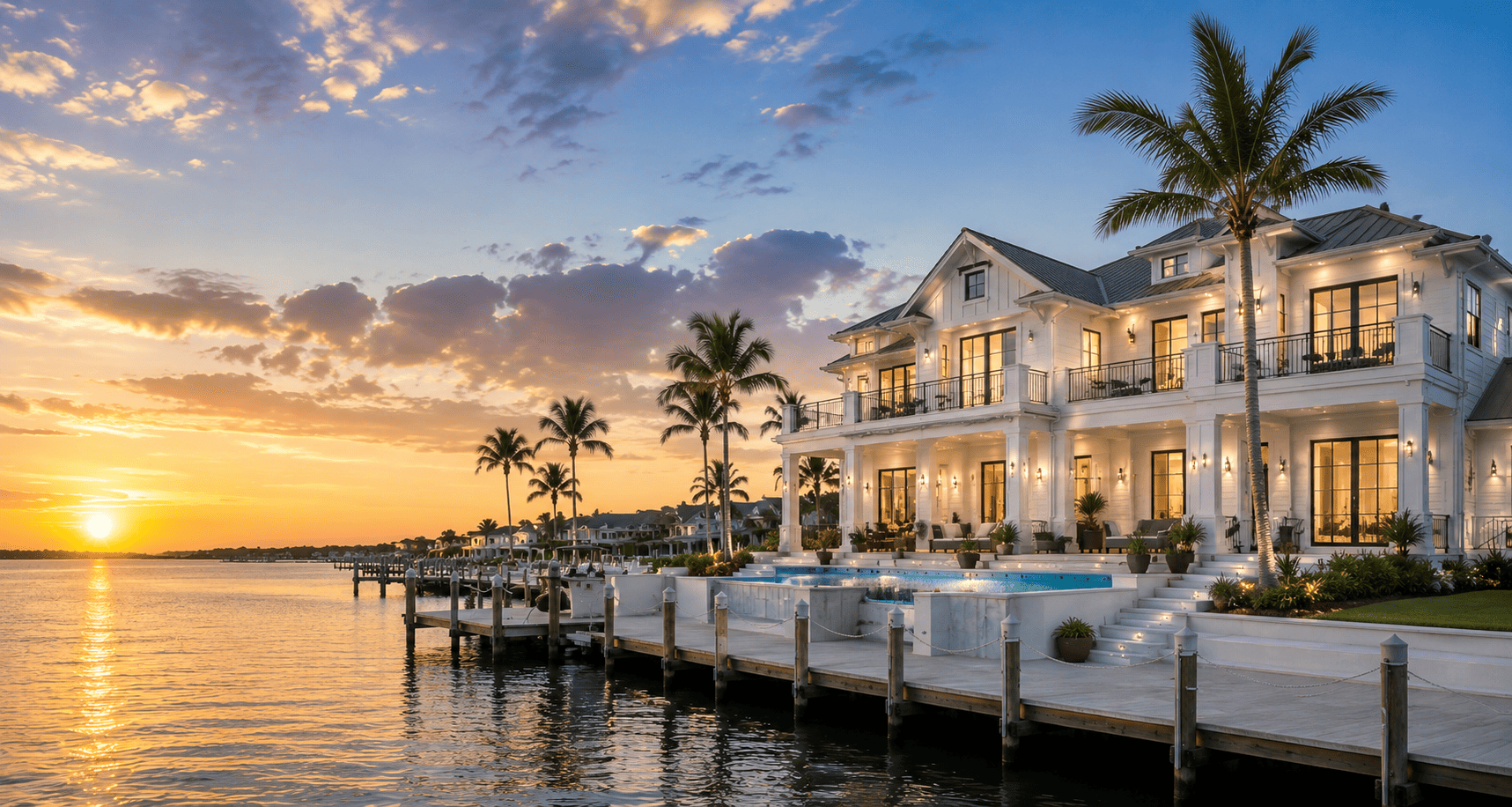
A lot of Florida custom homes get painted “coastal” and end up looking like a faded rental. Everything is beige-white. The trim disappears. The rooms go flat at 2 p.m. when the Gulf light slams through the sliders. Then the owner wonders why the $80,000 kitchen feels cheap.
Coastal does not mean washed out. It means light, salt, water, and sand without draining the color out of the house. Neutrals can do that if you build contrast, warmth, and a few real materials into the plan. If you only lighten everything two shades, you get a showroom, not a waterfront house.
Why pale houses die in this light
Florida coastal light is harsh and high. West-facing rooms on the Sound or the Gulf get a long, hot afternoon. East rooms go gold in the morning and dull by lunch. A color that looked soft in a northern paint deck reads chalky here.
Cool gray-beige on every wall is the usual mistake. So is builder white with no contrast trim. So is matching the cabinets, walls, tile, and countertops to the same sand tone. When value and undertone are identical, the eye has nothing to land on. The house feels incomplete, not calm.
Humidity and salt also change how paint reads. Gloss shows every bump. Flat walls scuff. A washed palette with cheap eggshell looks tired in a year. Spec the sheen and the undertone as carefully as the name on the chip.
Start with undertone, not “beige”
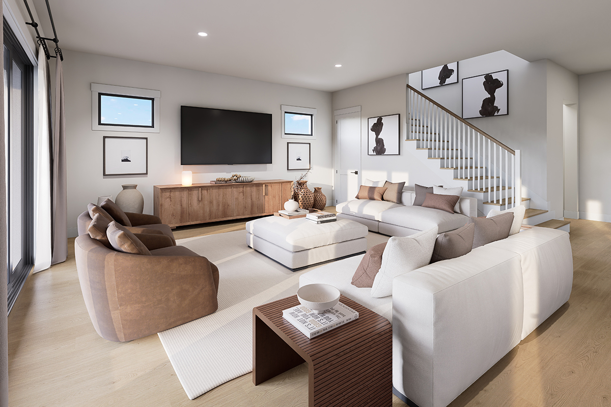
Every neutral leans warm, cool, or green. Coastal work in Pinellas and the Tampa Bay coast usually wants a warm or softly green undertone, not a purple-gray.
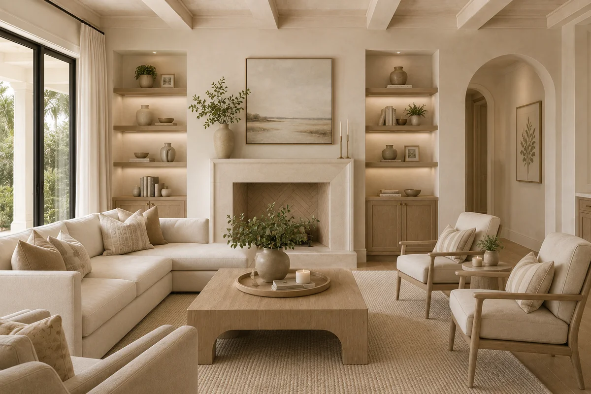
Warm sand and oat colors hold up against oak trees, pecky cypress, and sunset light. Think of dry beach at 5 p.m., not hotel hallway. Soft greige with a yellow or taupe base works in living rooms that face water. Greige with a blue-violet base turns dingy next to a turquoise pool.
Green-tinged neutrals are useful near live oaks and mangrove edges, which is most of Crystal Beach, Ozona, and Old Clearwater Bay. A warm stone or putty with a hint of olive ties the interior to the lot instead of fighting it.
True cool gray belongs in small doses: a powder bath, a steel stair, a fireplace surround. Whole-house cool gray on a Florida waterfront reads institutional.
White is not one color. A white with yellow in it sits better with oak and brass. A white with blue in it sits better with marble and chrome. Pick one family and stay in it. Mixing a blue-white trim with a creamy wall is how a custom house starts looking accidental.
Build a three-layer palette
A coastal neutral scheme needs three values, not one.
The field. Walls in a warm light neutral. Not the lightest chip on the card. One step deeper so the wall still has body when the sliders are open.
The trim and ceiling. A cleaner white in the same undertone family, or the wall color in a higher sheen on trim if you want a quieter, more tailored look.
The anchor. Something darker and drier: bronze hardware, a stained white oak floor or a mid-tone wood-look porcelain, a charcoal or deep olive island, black window frames if the architecture can take them.
That third layer is what stops the washout. Without it, the room is a cloud. With it, the pale walls feel intentional.
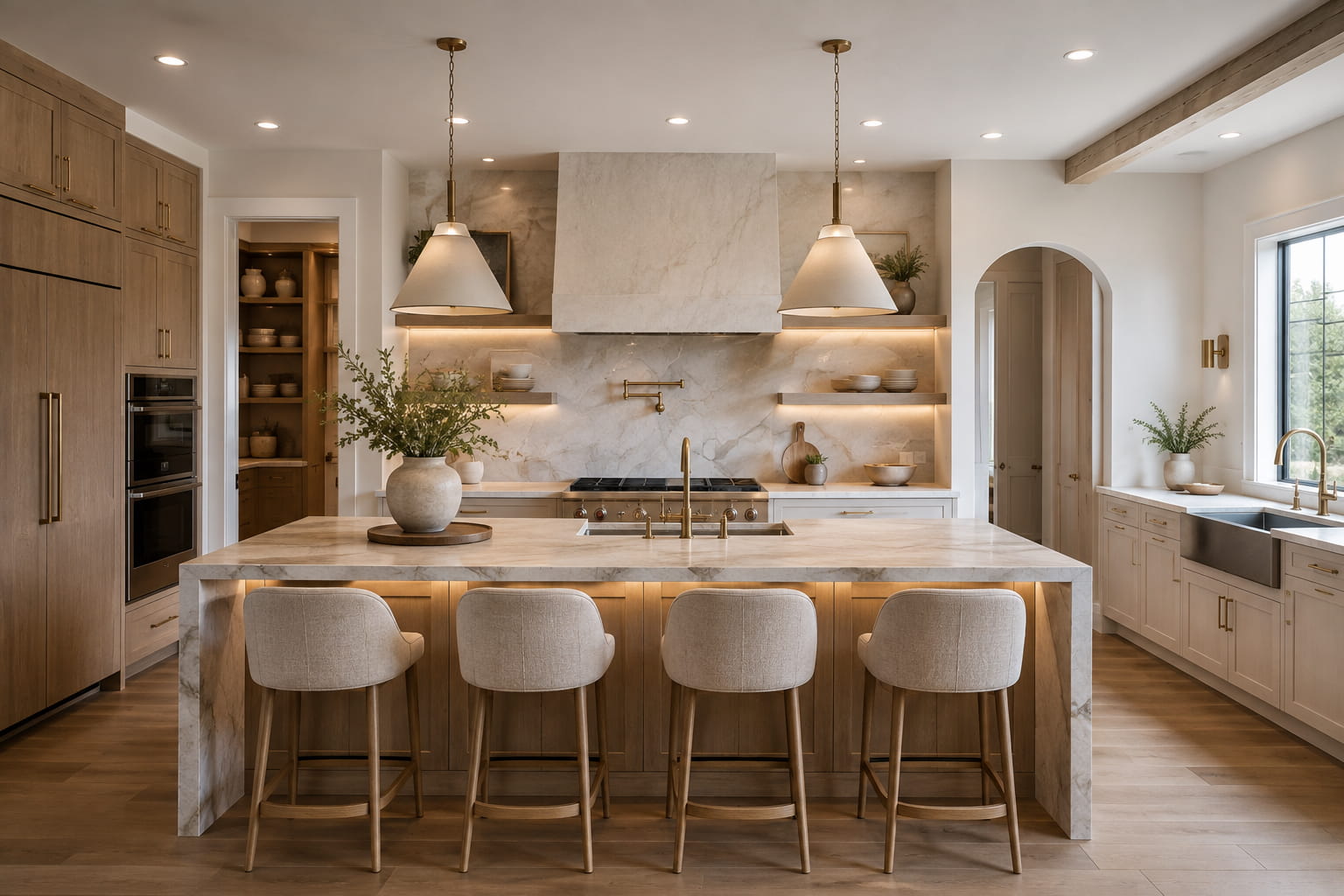
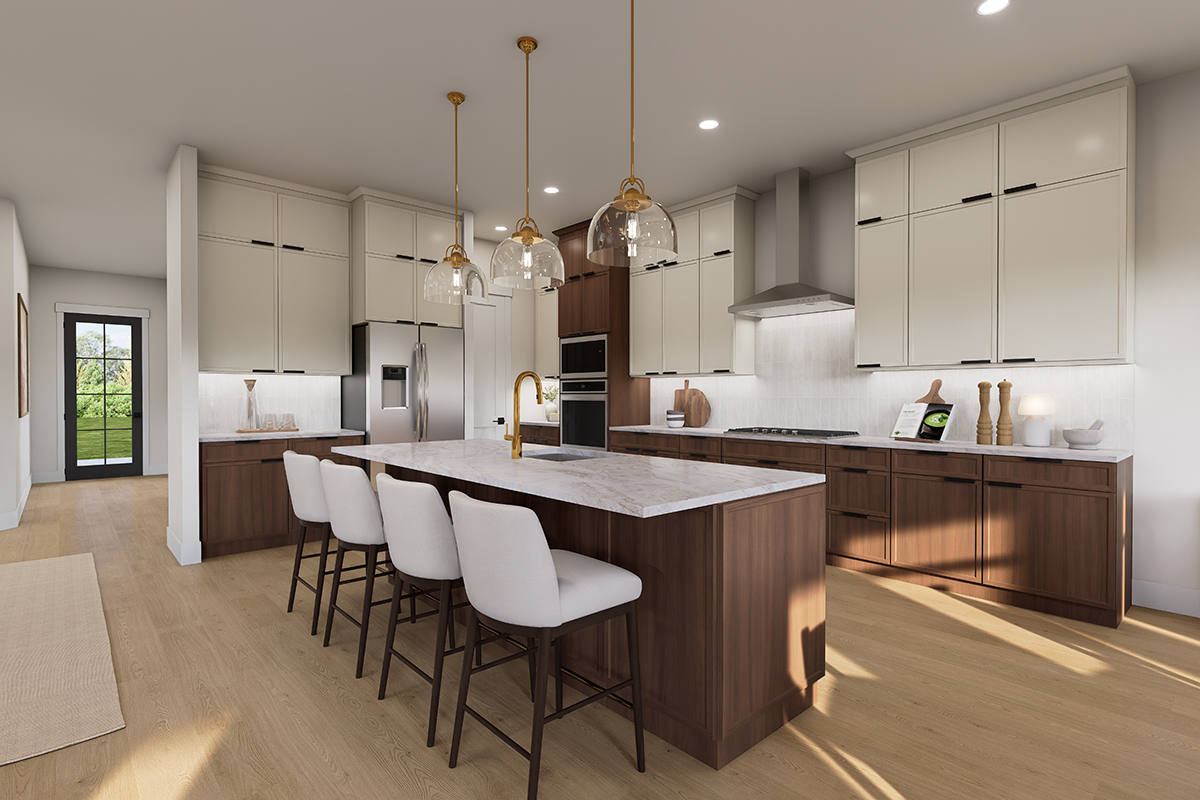
Cabinets can carry the field or the anchor. All-white kitchens still work on the water if the counters, floor, and metal have contrast. An island in a deeper clay, olive, or warm charcoal does more for “coastal” than a driftwood sign over the range.
Use materials as the color
Paint should not do all the work. Coastal houses that feel expensive use real surfaces.
White oak, rift sawn, with a clear or light natural finish beats a gray-washed floor that will look dated next to last year’s LVP sample. If you are in flood country and chose porcelain, pick a wood-look or stone-look with visible grain and a mid value, not a bleached plank that photographs white.
Stone and quartz should have movement. A countertop that is one flat cream next to cream cabinets is the washed-out kitchen. A warm white with faint taupe veining, or a honed limestone look, gives the eye a pattern without going busy.
Metals: aged brass, bronze, and blackened steel read coastal and current. Polished chrome everywhere leans yacht-club 2008. Mixed metals are fine if one dominates.
Textiles and tile carry the water reference so the walls do not have to. A shower in a soft sea-glass green or a dusty blue-gray. A runner with a faded indigo stripe. Outdoor cushions in sand and rust, not aqua and coral on every chair. One blue is enough. If every surface tries to say “ocean,” none of them do.
Room by room, keep it simple
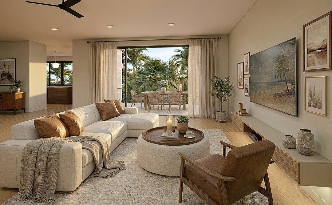
Living room facing the water: keep walls quiet. Let the view be the color. Use a warmer field color than you think. Put the darker notes in the sofa base, the table, the window frames. A huge pale sectional on pale walls on a pale rug is how a custom great room disappears.
Kitchen: cabinets one or two steps from the wall, not identical. Floor darker than the cabinets. Backsplash with a slight shift in sheen or pattern, not a matching slab that erases the wall line unless the architecture is truly minimal and the lighting is excellent.
Bedrooms: you can go lighter. Bedrooms tolerate softer neutrals because they get less afternoon blast and less sand traffic. Still add one grounded piece: a wood bed, a darker bench, a woven shade.
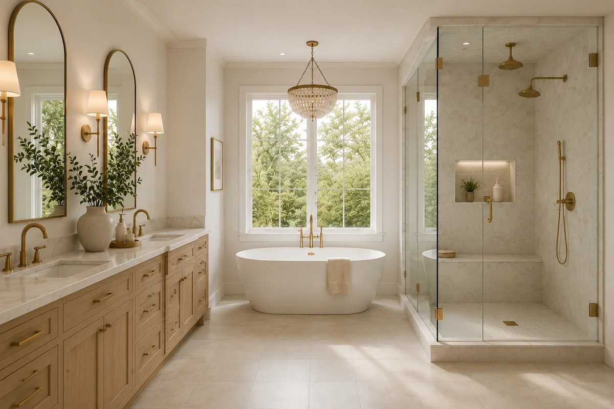
Baths: this is where a cooler note belongs. Soft gray-green wall, warm white trim, stone that is not pure white. Porcelain that can take wet feet. Avoid high-contrast black and white checkerboard unless the house is already that sharp. Most waterfront custom homes look better with tone-on-tone and one dark fixture finish.
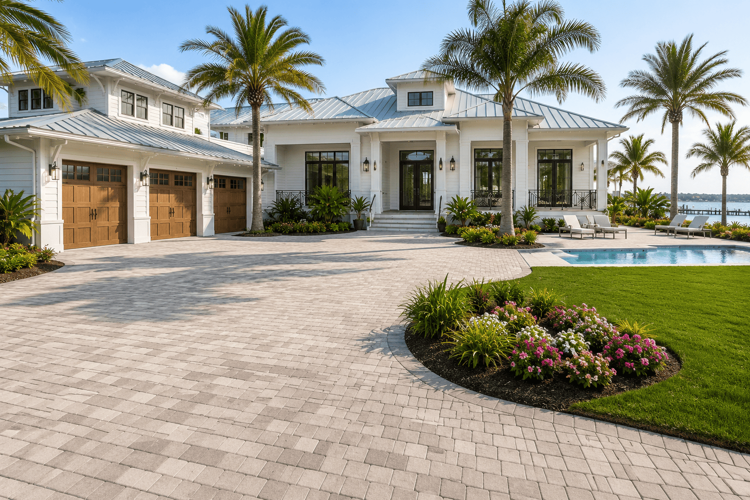
Exteriors: washed-out happens outside too. A house painted the lightest greige with white trim and no shutter or beam color looks unfinished against a blue sky. Body color with a little sand or warm gray, trim cleaner, and a deeper door or garage face will hold up in satellite photos and on the street.
What to skip
Skip the all-gray house. Skip matching every finish to “greige.” Skip cool fluorescent whites in a room with west glass. Skip turquoise walls unless you are committed to a specific vintage look. Skip driftwood gray floors plus gray cabinets plus gray tile. That is not coastal. That is a catalog page from 2016.
Also skip collecting seven “coastal neutrals” from seven different brands and hoping they blend. Pull one brand’s family, put large samples on the actual wall, and look at them morning and late afternoon with the sliders open. A 2-inch chip lies. A 2-foot board does not.
A palette that works here
A reliable custom-home mix for this coast:
- Walls: warm stone or light oat with a yellow-taupe base.
- Trim: a clean warm white, not stark blue-white.
- Floor: medium natural oak or a mid-tone wood-look porcelain.
- Kitchen island or vanity: deeper olive, clay, or warm charcoal.
- Metals: bronze or black, one dominant.
- One water color: muted blue-green in tile, textile, or a single painted door.
That reads coastal because it has light, warmth, and a horizon line. The pale parts have something darker to sit against. The house will still feel bright at noon. It will not look like you ran out of color.
Coastal is not the absence of color. It is control. Use neutrals that have blood in them, give the room three values, and let wood, stone, and one honest blue do the rest.